Tuesday, 30 October 2012

Having a cracking time!

The challenge at Three Muses is Timepieces so I decided to post a piece I made for my partner.  The piece has been created in a smash journal, which is ring bound with various types of paper.  This piece is on high quality print paper (hence, there is no paint!). 

My grandfathers clock was too old for the shelf so it stood 90 years on the floor
 I started by drawing a rough shape of a long clock with a black marker.  I then drew a circle where the face of the clock would be and coloured it with very dark brown distress ink.  The whole background is coloured with Tim Holtz distress inks in various colours from the brown / blue range.  I used a blending sponge most of the time but also used direct to paper technique.

I had the clock face in my scrapbook paper stash (I think it could be Tim Holtz) which was the perfect size.  I cut it out and then applied a VERY thick layer of Tim Holtz distress crackle paint.  It was incredibly thick but didn't run off the edges.  Putting it somewhere it could stay undisturbed for 24 hours as I watched  it curl and buckle.  They straighten up once you crack them flat again

The clock face was edged with brown distress ink and then glued to the background.  The wings were stamped, embossed and have a metallic paint effect applied prior to being cut-out and glued.


The base of the clock has chains and little penny farthing bicycles to represent the weights with a coin as the centre weight.  All the metallic elements are glued using glossy accents to prevent them coming lose.

The various quotes and sentiments about time are all printed on my computer using Albertsthal Typewriter font and then glued to the page.

For those wondering, yes he does sometimes use the smash book to stick 'guy' stuff in: beer labels, strange diagrams I don't understand, and he writes the weather in it sometimes too - go figure!


Sunday, 28 October 2012

My heart was broken

I learnt a valuable art lesson today with this piece.  When things go terribly wrong with a piece, don't throw it away, just keep working it until the problem is resolved.

I am so pleased I did.....

My heart is full of hope
Because this piece went through a major rework, it has a ridiculous number of layers.  I'll omit the error layers in the description, so as not to confuse anyone.  The first layer was gesso, followed by high build molding paste through a stencil.  Then came golden fluid acrylics in red, white,  yellow and my new favourite Iron Oxide (it sparkles).
While that was drying I used a gel medium transfer technique on the cherubs to put them on canvas (worked really well).  Then I used a scrap of canvas as a stamp and randomly stamped with heavy paint.
The wings are grunge paper, painted brown / black then embossed with silver, then again with UTEE to give a look of tin.  Distressed them with black paint to knock back the shine.
The large heart is a technique I've been playing with for a few weeks.  Card stock with high gesso peaks, texture paste, bead gel and high lift molding paste.
Next I applied paint techniques using burnt umber, fine gold, fine bronze, teal, white and some more iron oxide.


The heart shape was torn from orange card stock, painted it with Lumiere paints and then glued it to the base card before stamping with a crackle stamp.  It was finished off with some random stamping and my trusty oil pastels.


Tuesday, 23 October 2012

I shouldn't scare myself like this.....

I usually avoid scary movies, scary books and scary Halloween!  This week on Three Muses the theme is 'Something wicked this way comes'.  I started with a piece but it was too scary for me so I started again with the piece below.

Deciding to take a less horrific approach, I painted up some white card stock with Lumiere Halo Blue Gold paint and then stamped and embossed some skeleton keys down the right hand side using distress ink black embossing powder.

How lovely to see you darling!
Using artists canvas I painted a half a face with Golden Liquid paints.  I discovered that if I mix the paint with Windsor and Newton Matt Medium, it forms a great crackle, so I used that on the hair.  

The eye is orange with a red shadow at the top.  The text was edged in festive berries distress ink and then I dribbled cranberry alcohol ink down in a couple of spots to represent  blood.  I finished off the end of the dribble of blood with some glossy accents to make it look still wet.
  
For those who have a love of all things ghoulish and horrid, I have put the unfinished piece I did below.  The monster / ghoul thingy is a transfer technique using heat resistant acetate.  I will probably delete it from this post after Halloween because it's just not my style.  If anyone would like this postcard piece, I'd be happy to send it to you (or else my shredder!)

Sunday, 21 October 2012

It's halloween!

The challenge at Sunday Postcard Art this week is Retro Halloween.  I'm not really a fan of Halloween and always struggle with art for this holiday.  However, it wouldn't be called a challenge if it was easy, would it :)

I'm such a lonely pumpkin!
I coloured white card stock with both yellow and orange water soluble crayons and then wiped it with a baby wipe to spread the colour.  Next came some quickly hand drawn buildings on a hill.  For some reason I painted them with Mars black rather than colour them with a marker, which would have been much quicker.

Next came stamping across everything in Archival Sap Green ink and a cobweb stamp.  Then stamping again with the same stamp but with Monarch Orange Ink.  I notice it looks silver on the photo where it overlaps the Mars Black paint.  (Might have to play with this as a technique)

I drew a pumpkin and coloured him with Inktensils in orange, yellow, dark brown and light brown, then applied a little water to spread the colour and blend.  I drew around the outside of the pumpkin with a deep blue inktensil and applied water to give a soft outline.  The moon was hand drawn on white printer paper and painted with silver paint.

Finally I stamped around the bottom edges with a leaf stamp, first in StayzOn Black and then my favourite London Fog.

Tuesday, 16 October 2012

A little bit vintage

This weeks challenge at Three Muses is Vintage but I struggled with any real clear concept of what I wanted to do.   After some playing around this is what I eventually came up with.
What about a Pimms darling!
The background is white Neenah card stock, with an open flower design stamped and embossed in white detail embossing powder.  I put some Vintage photo and Broken china distress ink on my craft mat and then spritzed it with pearlex powder mixed with water.  Then I dragged the paper through the various inks.  Drying the paper between each dipping.

Next I inked up some Claudine Hellmuth sticky back canvas with Antique Linen distress stain and left that to dry while I stamped an coloured the Vintage lady.  Once everything was dry I assembled as you see here and to finish I stamped the word Vintage at the top and a definition of Vintage at the right hand side.

Unfortunately you can't see the fabulous shimmer coming from the pearlex powder in this shot.  In real life it sparkles with silver.

Monday, 15 October 2012

Time for the movies!

The word at Take a Word Monday is Poster, to represent a crime move poster.  I wasn't sure what I would do with this until a thought struck me.

This is the first time I've ever done a mono-chromatic piece and I have to say I did enjoy it once I got started.
I'd love to see this movie 

I started out by making a mask for the door and then used tape to mask the lighted area through the door.  I mixed Mars Black and titanium white and painted the walls and floor.  A quick search on the internet found me the silhouette of the man, that I tweaked in Photoshop to get him the right size.
Removing the masking I attached the man in the doorway, painted the light shining through the door with a little, black, white and some silver.  The shadow is black and white with a touch of red.

The words were always going to be a challenge, so I fussy cut the word WHO? and added some red to represent blood.

No texture on this piece, which is rare for me but I do like the starkness of it.

Sunday, 14 October 2012

Stone the crows!

The challenge this week on Sunday Postcard Art is Crows, which is part of the 4 weeks of Halloween.  I know that the crows should probably be in a Halloween context but I'm taking a tangent.

Welcome to my crazy crow.

The crow who wouldn't quiet down.

 I sprayed the postcard with Bubble Gum pink and sunshine yellow Dylusions sprays before stamping a small script stamp in Archival Orange and a cross hatch stamp in Archival Magenta.  Across the bottom I stamped a small checker pattern in Memento London Fog.  This is an amazing shade of ink because it always looks to be layers below everything else, even if it's not.


Next came some white gesso through a stencil and the pink dye has fed through and given it a pearly sheen.  I used black gesso through a stencil at the bottom and then painted the black squares with interference red, the interference gold on the white gesso.

Mr crow was found on a search on the internet and the crown I cut from a scrap of paper.  To give it some texture I applied perfect pearls to the crown and the white circles

Tuesday, 9 October 2012

Horsing around with the clowns

This page was inspired by the Three Muses Challenge today - under the sea.  I started the piece a few days ago and decided to make a video, but I was not too happy about how it was going so stopped making the video and left it on my desk for a day or so.  Then suddenly my muse woke up and I quickly knew what I wanted to do, and now I love it.


Don't those anemone tickle?

The page is sprayed with Dylusions turquoise spray ink at the bottom and London Blue at the top.  I then stamped swirls in Archival French Ultramarine at the top and sap green at the bottom (you can barely see that now.  Next came some glass beads texture gel along the bottom to represent the sea bed.

I then applied high solids medium through a stencil because I thought they look like bubbles once they dry clear.  Over the top of all of that I sprayed some Cosmic Shimmer Vintage Mist in French Navy.  For the next layer I painted over the glass beads with iridescent water colours in several shades of blue and green.


Having painted the background I started on the foreground and drew a seahorse, a couple of clown fish and some anemones. The fish, seahorse and anemones were painted with iridescent paints in various colours before I glued them to the background and attached some tiny shells.

I found the perfect mermaid on the internet somewhere and painted her tail also with iridescent green / gold paint.

All in all I love the way it turned out despite the slight bump on the journey.

Sunday, 7 October 2012

By the light of the silvery moon...

The challenge at Sunday Postcard Art today is moonlight, and anything about Halloween is always a challenge for me.  It was late last night, the darkness all around and rain hitting the window pane when I was overcome by madness and my creation was born.....

Step away from the cleaning fluids now!
I didn't know if the idea would work but gave it a try.  I have a Paper Artsy stamp of a ruined monastery with a ghostly figure and I decided to try to stamp it with bleach on midnight blue card stock.  Yes, that's right - bleach!

I made the stamp pad from folded kitchen towel and applied bleach to the pad.  The first couple of attempts were a shambles with either the image being too soaked with bleach or not enough.  I realised it was impossible to get a clean image so I chose one that was under 'done' and used a paintbrush to finish up the monastery, and the moon.

The leaves around the sides and base are stamped in London Fog Gray and StayzOn black.  The moon was enhanced with some very translucent Golden Fluid medium in Zinc White.  The bats are actually swallows from a sea scene but I pressed extra hard on the stamp to make them fatter, voila bats!


There is no texture and I'm not sure this piece will survive very long since I didn't apply anything to prevent the action of the bleach continuing.  If you try this technique, it all depends on the type of paper what your results will be.  When I tried gray paper, the bleach removed the colour back to a pale gold.
Always wash your brushes and stamps quickly to avoid any damage.

Friday, 5 October 2012

Roll up, roll up, the circus is in town


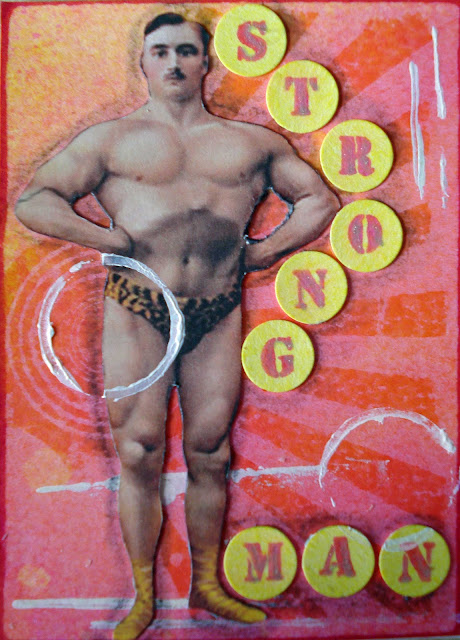
A few weeks ago I created a couple of ATCs for a swap in the theme of Demented Circus.  I found it really difficult to do a circus theme and it took me longer than I expected to complete them.

That's Ms Clown to you!
The backgrounds were created on heavy weight white cardstock and sprayed with bubble gum pink Dylusions spray then stamped with Archival Magenta and a Tim Holtz stamp.  I applied some white paint in circles and lines before adding some small reflective elements to her hat.
The yellow circles were stamped with Archival Magenta on white cardstock sprayed with a lemon yellow spray.  I went over the lettering with a Sakura pen in clear to give it a bit of bling.


I am having lots of fun making and swapping ATCs and inchies, so you may see some more in the coming weeks.  If anyone would like to do a swap, please let me know.

Tuesday, 2 October 2012

Childhood happiness

Today on Three Muses we are asked to create a journal page to illustrate a favourite phrase or song.   I have created a page in my large journal based on a favourite quote - Happiness is where we find it, but rarely where we seek it!
Raw Journal Page
The background has more layers than an onion and began life with a gesso base, then spray inks, then several layers of paint, then several layers of stamping, then some stencil work.

When I thought of what makes me happy, I decided that today it's flowers and happy faces.  I stamped the flowers on white card stock and coloured them in with  markers, before giving each one a smiley face using Posca paints.

I painted the flower stems in green metallic paint (I don't know why) and did a white translucent halo for each flower.  The writing is very childlike completing the image.

I have to smile every time I look at this page.